By Saghar Setareh, CoContest guest contributor
How can you know the best style for staging a property? After all, you’ll need to satisfy home buyers’ various style tastes as well as make sure you’re showing the property in its best light.
Thanks to the power of the Internet, we wanted to see just how much the point of view in staging of properties can vary. We asked for designers to upload their take on one floorplan at the CoContest website. All designers staged the same room, but recreated it differently based on their own style and taste and interpretation of the client’s request in the contest.
The challenge: This modern apartment in Connecticut needed to be renovated, in a way to enjoy the artwork during the gatherings of family and friends.
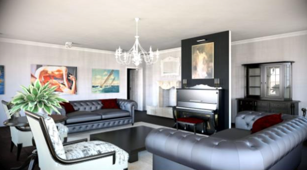
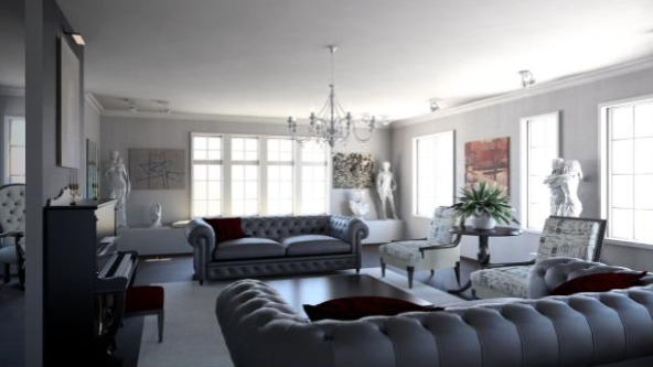
Design 1: Classic Vibe
This room offered up a more classic appeal. The designer Decolite Design used a crystal chandelier for the main lighting, colonial furniture for the main living room, black chesterfield sofas with white armchairs, and a large, white rug. The artwork is also from the classic period. The pallet of colors is black and white, and a piano along the wall also helps to complete the look.
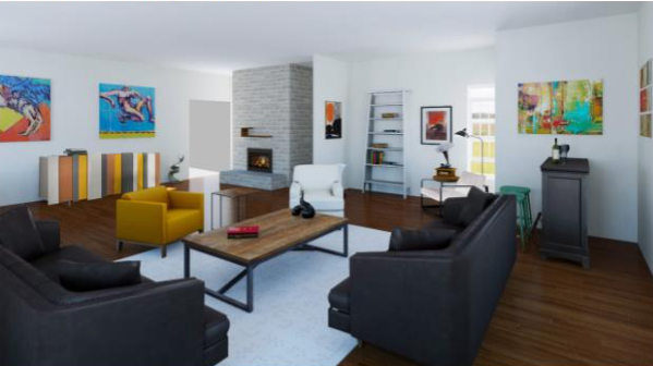
Design 2: Bold Artwork
This designer Marta Valente above used bright and saturated colors in the artwork to compliment the two dark sofas and white and mustard color chairs. In order to add a more modern and industrial look to the space, a wooden table with metal legs was brought in. To complete this look, the wall has gray bricks and there’s a colorful buffet in stripes along one wall.
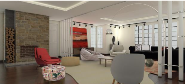
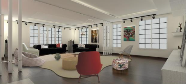
Design 3: A Modern Touch
Another designer BIVIO Architettura. Paula Godoy & Celia Cardona used very modern furniture from the late 20th Century, puffs, and large paintings to work as a separator. Texture is also used in the modern furniture and couches to match the abstract paintings on the wall. Low, coffee table and cushions are also part of this look. But the most distinctive feature of this project: The vertical bars that divide the living room in two separated parts.
These are only three design ideas from many, that present the property in three, completely different styles, made possible to imagine how the property would look like, with a convenient price.
ABOUT THE AUTHOR: Saghar Setareh is the Content Manager of CoContest, the first crowdsourcing platform for interior design and architecture online. She is an enthusiast about home decor and all forms of design.
